Intuitive directions
Seamless in-store navigation for shoppers
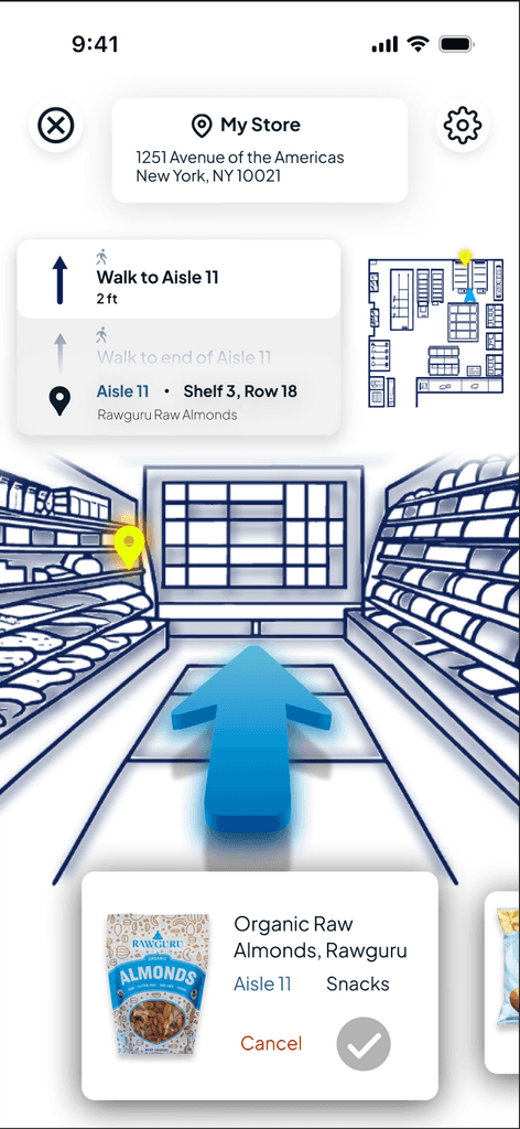
Foodly is a responsive grocery store app designed to help users quickly locate items in-store with intuitive navigation based on common mental models of GPS directions.
Goal
The goal of the Foodly app is to help users quickly and efficiently locate grocery items in-store, streamlining their shopping experience.
Problem statement
Users often experience frustration and inefficiency while shopping in-store, as they struggle to locate specific grocery items quickly. This leads to a longer, more cumbersome shopping experience that could be significantly improved with better navigation and item-finding tools.
Target audience
Users often experience frustration and inefficiency while shopping in-store, as they struggle to locate specific grocery items quickly. This leads to a longer, more cumbersome shopping experience that could be significantly improved with better navigation and item-finding tools.
My process for designing Foodly involved user research, wireframes, prototyping, and usability testing to create an intuitive in-store navigation system that helps shoppers quickly locate items.
Understanding the user
I started by talking directly to users, uncovering the universal frustration of wandering grocery aisles in search of that elusive jar of salsa. Through interviews and surveys, I got a clear picture of how shoppers plan and navigate their trips. I also asked users about any tools they use to help them find things in their daily lives. I crafted user personas and defined the core shopping pain points, then mapped out user flows to ensure Foodly could turn a potentially chaotic trip into a streamlined experience.
Starting the design
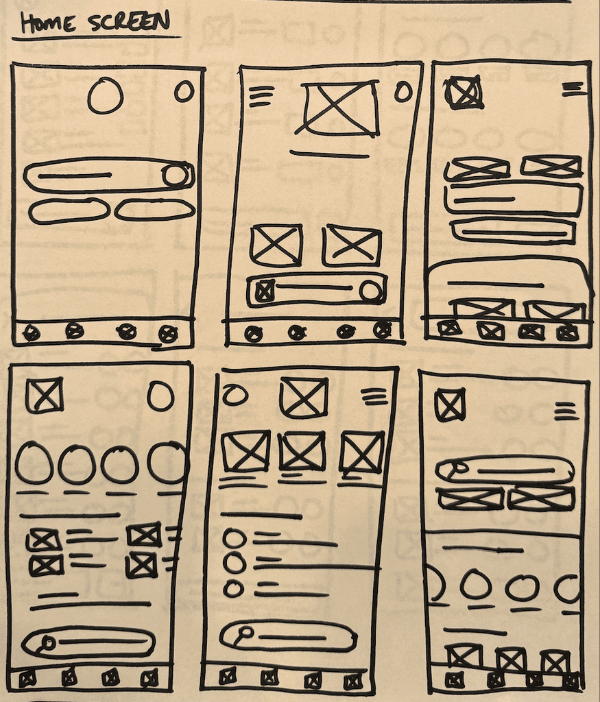
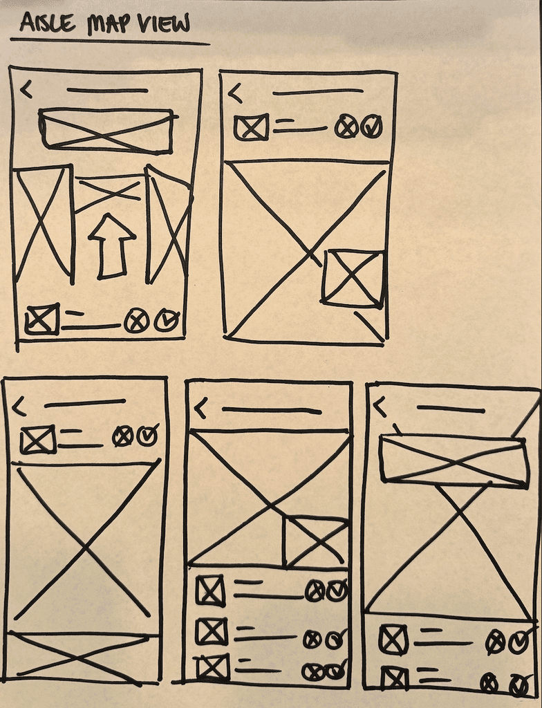
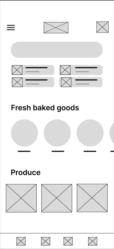
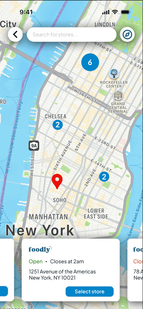
Flush with insights from users, I sketched wireframes that focused on simplifying the in-store search process—because no one wants to play hide-and-seek with groceries. Digital wireframes and low-fidelity prototypes followed, bringing those ideas to life. Usability studies helped me fine-tune the app’s layout and core features, making sure users selected the right store and found their items using common GPS design patterns—all without guesswork.
Refining the design
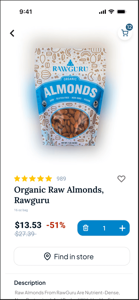
After feedback, I took things up a notch with high-fidelity mockups that nailed the app’s clean, intuitive navigation and responsive design. Accessibility checks were a priority, making sure the app worked for everyone. The final round of testing allowed me to perfect the details, ensuring users could locate items and navigate the store effortlessly, making grocery shopping fast and fun.
Foodly’s UX was designed to simplify in-store shopping by using intuitive, GPS-like navigation to help users quickly find grocery items with ease and efficiency.
Seamless browsing & shopping
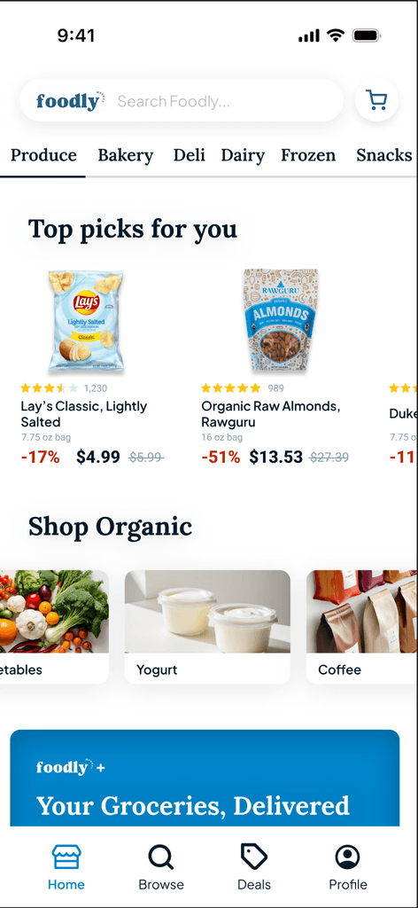
The app allows users to browse products and create personalized shopping lists before arriving at the store, or browse for products as they shop.
Step-by-step in-store directions
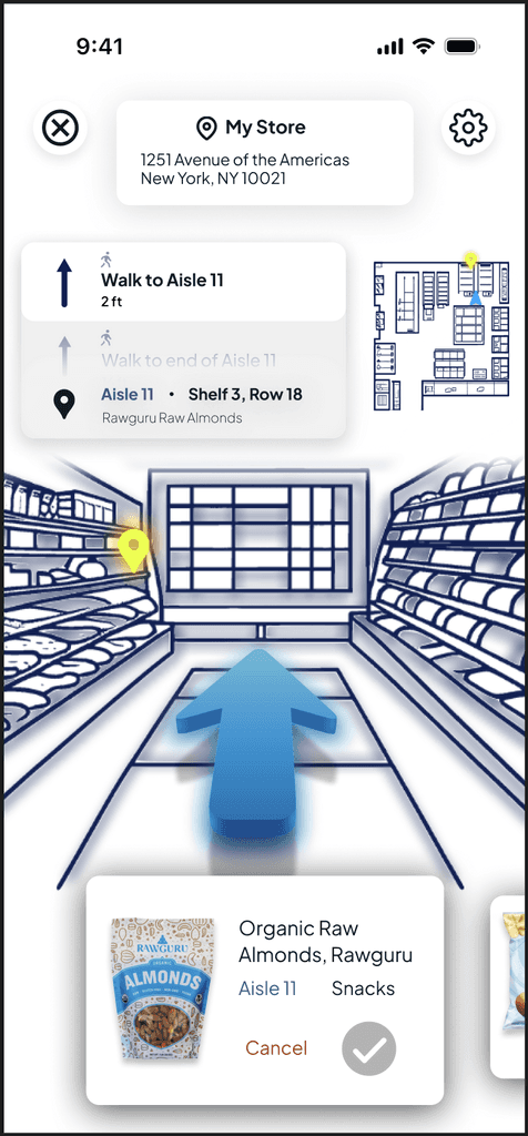
The app offers in-store navigation modeled after familiar GPS systems, providing aisle-by-aisle directions to help users efficiently locate items.
Intuitive UI
By incorporating familiar GPS design patterns, the interface is intuitively structured to help shoppers ensure they're in the correct store, then locate items faster and navigate the store with minimal friction.
Here, the outcomes and achievements of the project are highlighted, including user feedback, adoption rates, and industry recognition.
UX Research Skills
By identifying the mental model of GPS navigation in user interviews, I was able to apply familiar design patterns to the app, improving the speed and ease with which users locate items in-store.
User-Centered Problem Solving
This project reinforced the importance of solving real user frustrations—by focusing on in-store shopping pain points, I was able to design a solution that streamlined the grocery shopping process from browsing products to quickly locating them.
Positive User Feedback
Usability testing showed strong user approval for the app’s intuitive interface and navigation, with users consistently noting how much faster and less frustrating their shopping experience would become if they had access to those directions in real-time.
